When creating Japanese technical documents, layout isn’t just about aesthetics – it’s about trust and usability. Japanese typography and document design follow unique principles that differ significantly from Western conventions. Here’s what you need to know:
- Uniform Grid System: Japanese characters (Kanji, Hiragana, Katakana) fit into square frames, creating a tightly packed grid. This structure ensures readability and clarity.
- Text Orientation: Horizontal writing (yokogaki) is common for technical documents due to its compatibility with Latin scripts and symbols.
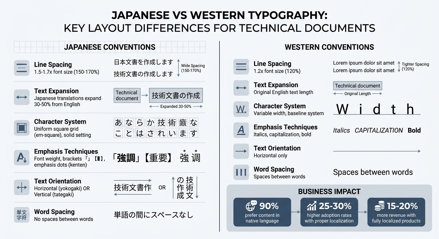
- Line Spacing: Japanese text requires wider line spacing (1.5–1.7x font size) compared to English, preventing visual clutter.
- Text Expansion: Translations from English to Japanese often expand by 30–50%, requiring careful planning for layouts.
- Emphasis Techniques: Japanese text doesn’t use italics or capitalization. Instead, font weight, brackets, or emphasis dots (kenten) are used.
- Grid-Based Layouts: The kihon-hanmen grid system governs character size, line length, and spacing, ensuring consistency.
- Typography Adjustments: Larger font sizes and proper contrast ratios improve readability, especially for dense Kanji characters.
Proper localization isn’t just about translation – it’s about aligning with Japanese standards for typography, layout, and structure. Following these principles can improve user trust, increase product adoption by 25–30%, and drive revenue growth by 15–20%.
Japanese vs Western Typography: Key Layout Differences for Technical Documents
Japanese Writing Systems and Document Layout
Japanese documents rely on three scripts: Kanji for conveying meaning, Hiragana for grammar, and Katakana for foreign words or terms. All three scripts are designed to fit within a uniform square frame (the em-square), creating a compact and consistent grid – a principle referred to as solid setting.
Since Japanese characters almost completely fill their em-square, they require more vertical spacing than Latin text for better readability. For technical documents, a line height of about 1.7 (170% of the font size) is recommended, compared to the 1.2 (120%) typical for Latin text. Without this adjustment, the dense structure of Kanji can make text harder to read, especially in detailed or technical contexts. This fundamental design influences decisions about text orientation and layout.
Vertical vs. Horizontal Writing
Japanese technical documents can be written in two orientations: vertical (tategaki) or horizontal (yokogaki). Vertical writing flows from top to bottom, with pages bound on the right, while horizontal writing flows left to right with left-side binding. Although vertical writing is traditionally used for novels and formal content, horizontal writing dominates technical documentation because it integrates better with Latin scripts, mathematical formulas, chemical symbols, and foreign terms.
Switching between orientations isn’t just a matter of direction; it also affects character formatting. For instance, parentheses and brackets must be rotated 90° when moving from horizontal to vertical layouts. In vertical text, Latin characters and numbers are handled in various ways: they can be set upright, rotated 90° clockwise, or grouped into tate-chu-yoko (short horizontal blocks within vertical text). Modern digital platforms, such as websites and mobile apps, almost always use horizontal layouts due to hardware and interface designs optimized for Western scripts. These orientation choices also impact how scripts and punctuation are formatted.
Kanji, Hiragana, and Katakana in Technical Documents
The combination of Kanji, Hiragana, and Katakana introduces unique formatting challenges. Unlike Latin-based writing, Japanese text doesn’t use spaces between words. Instead, line breaks can occur between characters, except where Kinsoku Shori rules prevent certain punctuation from starting or ending a line. Full-width punctuation marks must occupy their own square frame to maintain the visual rhythm of the grid.
When mixing Latin characters with Japanese text, it’s common to slightly enlarge the Latin characters. This is because CJK fonts (Chinese, Japanese, Korean) are designed to fill the em-square fully, often making them appear larger than Latin fonts of the same point size. Additionally, since Japanese doesn’t use italics for emphasis, designers often rely on other techniques like varying font weights, using Katakana for emphasis, or switching text orientation to create a clear hierarchy of information. These adjustments help highlight technical terms, product names, and key concepts while preserving the structured grid layout of Japanese documents.
sbb-itb-a752276
Basic Layout Principles for Japanese Technical Documents
Japanese technical documents are built on a precise grid system that ensures clarity and consistency. Unlike Western typography, which often relies on baselines and variable letter widths, Japanese layouts use a character body system. This means every character – whether it’s Kanji, Hiragana, or Katakana – fits into a uniform square frame, creating a structured and clean appearance throughout the document.
The Kumihan Grid System
At the heart of Japanese document design is the kihon-hanmen (basic page format), a logical grid that governs the layout. This grid defines several key elements: character size, line length, the number of lines per page, and the spacing between lines. The system often employs beta-gumi (solid setting), where character frames are placed edge-to-edge without extra spacing, creating a tight and consistent rhythm.
The grid also ensures that the first and last characters of each line align perfectly with the kihon-hanmen borders. Elements like headings and indents are measured in grid units rather than absolute measurements. For example, a "3-line space" is calculated as three character frame sizes plus two line gaps, and indents are expressed in multiples of character frames, such as a 4-character indent.
One challenge in Japanese technical writing is that translations from English often expand by 30%–50%. For headings with larger type sizes, this can create visual imbalance, which is addressed using tsumegumi (kerning adjustments) to minimize excessive negative space. These layout principles are standardized under JIS X 4051, which provides the technical foundation for Japanese document formatting. Beyond the grid, the standards also cover paper sizes and binding methods.
Page Size and Binding Standards
Japanese technical documents adhere to JIS P 0138 for paper dimensions, with binding determined by the text’s orientation. In horizontal writing (yokogaki), the binding is on the left (hidari-toji), while vertical writing (tategaki) uses right-hand binding (migi-toji).
This binding style also affects page numbering. For left-hand binding, even-numbered pages are on the left, and odd-numbered pages are on the right. For right-hand binding, the arrangement is reversed. These conventions ensure compliance with Japanese norms while maintaining readability for international audiences.
Column and Line Layout
The kihon-hanmen grid also dictates the arrangement of columns and lines, further enhancing document consistency. In horizontal writing, columns progress from top to bottom and then left to right. For vertical writing, the flow is from top to bottom and right to left. Japanese text is typically justified, creating a neat, block-like appearance that takes advantage of the uniform character widths.
To maintain alignment with the kihon-hanmen borders, adherence to Kinsoku Shori rules is crucial. These rules help ensure that the first and last characters of each line align perfectly. For multi-column layouts in horizontal text, the final page should be balanced so that columns have roughly the same number of lines.
Line spacing is another important aspect. Japanese technical documents typically use 1.5–1.7 line spacing, which is wider than the ~120% spacing common in Western documents. This extra spacing prevents dense Japanese characters from appearing cluttered, a critical consideration for clarity in technical writing. These layout standards are also vital when designing SaaS landing pages in Japan to ensure professional presentation.
Typography and Formatting Standards
Creating well-designed Japanese documents requires careful attention to typography to ensure readability. Japanese characters, with their intricate details, follow specific typographic rules that align with grid-based layouts, as previously discussed. Below are key adjustments that enhance the clarity and readability of Japanese technical documents.
Font Size and Line Spacing
Japanese characters are more visually detailed than Latin letters, so they require larger font sizes for proper legibility. For digital documents, body text should not go below 12px. While traditional print standards used 10.5pt, modern screens demand slightly larger sizes for better readability.
To avoid visual clutter, Japanese text needs a line-height of 150% (1.5 times the font size). This spacing ensures that Kanji strokes don’t overlap or create a crowded appearance. Adding letter spacing of 0.05em further improves clarity, especially in digital formats.
Japanese web localization often involves increasing font size, line-height, and letter spacing for better readability.
Line length plays a crucial role as well. For horizontal text on computer screens, aim for 15 to 40 characters per line, while smartphone displays work best with 15 to 21 characters. These shorter lines make scanning and comprehension easier for readers.
Paragraph Structure and Indentation
Japanese paragraphs follow specific guidelines, such as those outlined in JIS X 4051. Each paragraph’s first line should be indented by one full-width character (one em-space). This measurement, based on character units rather than absolute dimensions, ensures alignment with the grid system.
To maintain a polished appearance, apply widow adjustment (danraku-matsubi-shori), which prevents a paragraph’s final line from containing only a single character or punctuation mark. For block quotes or special sections, both the line head (jisage) and line end (jiage) can be indented to visually set them apart from the main text.
Text Emphasis Without Italics
Using italics in Japanese text is problematic. The dense strokes of Kanji make slanted characters harder to read, and CSS italic rules often create "oblique" renderings that further reduce legibility. Instead, professional documents rely on alternative methods for emphasis.
- Font weight variation (bolding) is the most common way to emphasize text.
- Switching between "Mincho" (serif-style) and "Gothic" (sans-serif) fonts helps establish a visual hierarchy.
- Specific brackets, like 「 」 (kagi-kakko) for emphasized words or quotes, and 【 】 (sumi-tsuki kakko) for headings or UI labels, add clarity.
For precise emphasis, emphasis dots (kenten) can be used. These dots appear above characters in horizontal text or to the right in vertical text. When applying any of these methods, maintain a line height of at least 1.5em to prevent emphasized characters from looking cramped.
Visual Design for Readability
When it comes to creating clear and engaging documents, visual design plays a crucial role, especially when working with the intricate strokes of Kanji characters. To ensure readability and prevent eye strain, attention to contrast, hierarchy, and background treatment is essential.
Contrast and Color Guidelines
For Japanese body text, maintaining a contrast ratio of at least 4.5:1 is critical for accessibility. Larger headings can use a contrast ratio of 3:1, though aiming for 7:1 provides even better readability. These ratios are based on relative luminance values, where 0 represents the darkest black and 1 the lightest white.
In dark mode, avoid harsh pure white (#FFF) and opt for softer grays like #EEE or #F2F2F2, paired with increased line height to reduce glare. On light backgrounds, using #222 instead of pure black creates a softer, more visually comfortable experience for readers.
"Japanese readability is decided by steady, basic typography." – greeden, IT & Life Hacks Blog
For technical documents, avoid relying solely on color to convey meaning. Instead, combine color with additional cues such as font weight, underlines, icons, or text labels. This approach accommodates readers with color-vision differences. For links, always pair color with underline styling to ensure they remain identifiable regardless of color perception.
These precise color and contrast adjustments help establish a solid foundation for organizing content effectively.
Information Hierarchy and Reading Flow
Japanese documents often contain dense information, making a clear hierarchy essential. Instead of relying on dramatic font size changes, use spacing to guide readers through the content. Generous spacing around headings can create a smooth reading flow without overwhelming the viewer.
The kihon-hanmen grid system is a key tool for structuring Japanese text. It organizes characters and lines into a logical layout, ensuring consistency and balance. Since Japanese text lacks spaces between words, justified alignment is commonly used to create a neat, grid-like appearance that reinforces this structure.
These techniques for spacing and alignment naturally lead to strategies for handling more visually complex elements.
Shira-Nuki for Complex Backgrounds
When text appears over images or busy backgrounds, shira-nuki (white outline text) can maintain legibility. Kanji characters require more pixels to remain clear – complex characters like "艦" need at least 15×15 pixels, compared to 7×7 pixels for a simple "A".
To make this work effectively, add a semi-transparent background layer behind the text. This ensures the necessary contrast ratio is maintained, even against shifting or multicolored backgrounds. For technical documents featuring screenshots or diagrams, this method prevents the dense strokes of Kanji from blending into the background noise, preserving clarity and readability.
Content Structure for Japanese Technical Documents
Organizing content effectively is a cornerstone of clear and reliable technical documentation. Just as thoughtful layout and typography inspire trust, a well-structured document ensures that critical information is easy to understand and act upon. In Japan, technical documents follow standardized formats (定型) to maintain consistency and credibility. This structured approach not only highlights key information but also strengthens the document’s role as a reliable reference.
Standard Document Sections
Japanese technical documents, such as development specifications (開発仕様書), requirement specifications (要求仕様書), and requirement definition documents (要件定義書), are typically divided into conceptual/basic design and detailed, component-specific requirements. A common approach is the "Main Sentence – Supplementary Sentence" structure: start with a clear primary requirement, followed by supporting details like diagrams or tables.
For example, in functional specifications, the main sentence might state, "We will achieve X performance" or "Add Y feature", while supplementary content explains product operations or provides visual aids. Similarly, in meeting minutes (議事録), the main statement outlines the decision (決定事項), with supporting details provided through individual remarks (発言). Takaaki Yamanouchi from Yamanouchi Research Institute, Ltd. emphasizes:
"Meeting minutes are documents that serve as evidence for business management. If the decided matters are ambiguous… there is a risk of problems arising when verifying the decision date or content later."
This approach ensures critical details are not overlooked, reinforcing the document’s reliability.
To clarify hierarchical relationships, use bullet points or tables where appropriate. When describing interactions, clearly separate roles such as "Developer Actions" (私たちの行為), "Product Operations" (製品の動作), and "User Actions" (ユーザの行為). Since technical documents often treat users as virtual entities, explicitly labeling "User" (ユーザは) can help maintain clarity. This structured method aligns with the broader principles of layout and organization discussed earlier.
Writing for Accuracy and Clarity
A clear structure is only part of the equation – precise language is equally essential. In Japanese technical writing, attention to grammatical particles and sentence construction is critical to avoid ambiguity. Use active voice for human actions (e.g., "Click the button") and passive voice for system responses (e.g., "A message is displayed") to clearly indicate who or what performs each action.
Keep sentences concise to avoid misalignment between subjects and predicates. Replace vague time expressions like "shibaraku" (for a while) with specific timeframes. When writing numerical ranges, include all digits (e.g., "5,000 to 6,000") to minimize confusion.
Be mindful of conditional particles: use "baai" (場合) for major conditions (e.g., "In the case of a system error…") and "toki" (とき) for minor conditions (e.g., "When you press the button…"). Negative expressions should be used sparingly, reserved for warnings or prohibitions to avoid unnecessary alarm. Maintain consistent politeness levels by using the "Desu/Masu" style for instructional steps and the "Da/De aru" style for headings, captions, and UI labels.
Breaking information into manageable chunks – ideally around seven items – can help readers process content more easily. Following the "Ki-Sho-Ketsu" (Introduction-Development-Conclusion) model can also enhance clarity by separating factual information from opinions.
Citation and Attribution Standards
Japanese technical documents must adhere to SIST 02 standards for bibliographic references and comply with Japanese Copyright Law (Article 48).
"The indication of the source must be made in a method and to an extent deemed reasonable according to the mode of reproduction or use." – Japanese Copyright Law, Article 48
SIST 02 outlines four key bibliographic elements:
- Author-related details (e.g., author or editor names)
- Title-related details (e.g., book title, journal name, or paper title)
- Publication details (e.g., edition, publisher, year, volume/issue, pages, DOI)
- Notes (e.g., medium, availability, access date for digital content)
These elements are listed in the order: Author → Title → Publication Info → Notes, with groups separated by periods and items within groups separated by commas.
For online sources, include the URL and access date (e.g., "Accessed May 12, 2024") since online content may change or disappear. Using a Digital Object Identifier (DOI) can provide added stability. When citing a Japanese translation of a foreign document, list the Japanese title and translator, followed by the original title and publication year in parentheses. For patents, include the country, patent type (e.g., "Unexamined Patent Application"), and specific number (e.g., 特開2003-131343).
To meet the "distinction" requirement under Japanese Copyright Law, clearly separate cited material from original text and use a consistent citation style throughout the document. In Japanese technical writing, references are typically labeled as 参照文献 (Sanshō Bunken) or 参考文献 (Sankō Bunken).
Conclusion
Creating effective Japanese document layouts is essential for winning over a market where 90% of people prefer content in their native language. By adhering to layout standards like the kihon-hanmen grid system and using proper text emphasis techniques, you demonstrate a genuine commitment to serving Japanese customers. These small but crucial details can make a big difference.
The impact of proper localization is clear. Fully localized products see 25–30% higher adoption rates and 15–20% more revenue. On the flip side, issues like broken layouts, truncated text, or clunky formatting can erode trust. As Yuga Koda, Co-Founder of Nihonium, explains:
"A partially localized product – one with mixed English and Japanese strings, awkward translations, or a UI that clearly was not designed with Japanese text in mind – signals to potential customers that the vendor is not serious about the market."
Japanese text typically expands 30–50% more than English, which means user interfaces need to be adaptable. They must accommodate multiple writing systems and use alternatives to Western styles like italics. Following JIS X 4051 standards ensures your documents meet the expectations of Japanese enterprises. These technical details directly influence how Japanese users perceive your product’s quality and your dedication to their needs.
FAQs
How do I adapt an English layout for 30–50% Japanese text expansion?
To accommodate a 30–50% expansion when translating English layouts to Japanese, you’ll need to adjust for the extra space Japanese characters require. Start by increasing line height for better readability and expanding the width of text containers to handle the additional text. You might also slightly enlarge font sizes or tweak letter spacing to maintain balance.
If the content demands it, consider using mixed layouts (combining horizontal and vertical text) or fully vertical layouts to suit Japanese reading preferences. Lastly, always test the design with native Japanese users to ensure the layout feels natural, readable, and provides a smooth experience.
What JIS standards matter most for Japanese technical document layout?
The main JIS standards that guide the layout of Japanese technical documents are JIS X 4051:2004 and JIS Z 8301:2019.
- JIS X 4051:2004 focuses on Japanese text composition methods, outlining how text should be structured and presented.
- JIS Z 8301:2019 sets the rules for formatting and drafting Japanese industrial standards.
These standards are essential for maintaining proper formatting and ensuring compliance in Japanese technical documentation.
What’s the best way to emphasize Japanese text without italics?
When working with Japanese typography, bold formatting or other typographical methods are preferred for emphasizing text. Italics are generally avoided because they are not traditionally used in Japanese writing to highlight or draw attention to words or phrases.