
Launching a SaaS product in Japan? Here’s what you need to know: Japanese users expect visuals that feel tailored to their preferences. Localization goes far beyond translating text – it involves redesigning visuals like charts, icons, and colors to match Japanese standards. Why does this matter? Fully localized products can boost SaaS adoption rates by 25–30% and revenue by 15–20%. But poor localization – like broken layouts or mixed languages – can damage your reputation and cost you customers.
Key insights:
- Japanese users prefer information-dense interfaces. Minimalist designs often seem "unfinished."
- Typography matters. Use fonts like Noto Sans JP and adjust for Kanji, Hiragana, and Katakana.
- Color psychology differs. For example, red symbolizes energy, not danger.
- Legal compliance is critical. Missteps can lead to fines up to ¥100 million under Japan’s APPI laws.
This guide covers everything from restructuring layouts to choosing culturally appropriate visuals, ensuring your SaaS product resonates with Japanese users and meets local regulations.
Planning Your Visual Localization Strategy
Start by mapping out a clear visual localization strategy. This means aligning your UI design with Japanese user preferences while tackling technical challenges like text expansion and Input Method Editor (IME) integration.
What Japanese Users Expect from Visuals
Japanese users have a strong preference for information-dense interfaces. While minimalist designs may win accolades in Silicon Valley, they often miss the mark in Japan. Here, users appreciate being presented with all the essential details upfront rather than navigating through multiple layers to find what they need.
Take the productivity app "FocusFlow" as an example. Initially, the app used English screenshots with minimalist headlines, resulting in a low 0.8% conversion rate in Japan. By switching to high-density Japanese captions, adding a "No. 1 Productivity Tool" badge, and localizing UI labels within the screenshots, the app’s conversion rate surged to 3.4% in just two weeks. This adjustment even propelled the app into the Top 100 Productivity chart in Japan.
To meet these preferences, consider the following design tweaks:
- Use fonts like Noto Sans JP or Hiragino, which accommodate Hiragana, Katakana, and Kanji.
- Increase line height by 10–15% and slightly reduce font sizes (10–15%) compared to Latin text.
- Keep in mind that color psychology varies: in Japan, red often symbolizes energy and good fortune, not errors or danger.
With these cultural nuances in mind, your UI design should be flexible enough to adapt to these requirements.
Building a Flexible UI Architecture
Japanese text tends to expand by 30% to 50% when compared to English. To manage this, avoid hardcoded containers. Instead, rely on auto-resizing components and responsive layouts that can adjust dynamically.
Another critical factor is accommodating IME, which helps users convert phonetic characters into complex Kanji. Design input fields like search boxes to handle IME composition states smoothly. Additionally:
- Support both full-width and half-width character inputs.
- Ensure databases and APIs use UTF-8 encoding to prevent data corruption.
"Shipping localization on top of poorly structured code = exponential future cost."
Proactively address these technical needs by simulating localization impacts. Use pseudo-localization tools to test text expansion and spot truncation or overlap issues early. Avoid embedding text directly into image files; instead, use CSS overlays or SVG text. This allows for easy localization and dynamic resizing. Lastly, store all translatable content in structured locale files or a Translation Management System to streamline continuous localization efforts.
sbb-itb-a752276
Localizing Specific Visual Elements
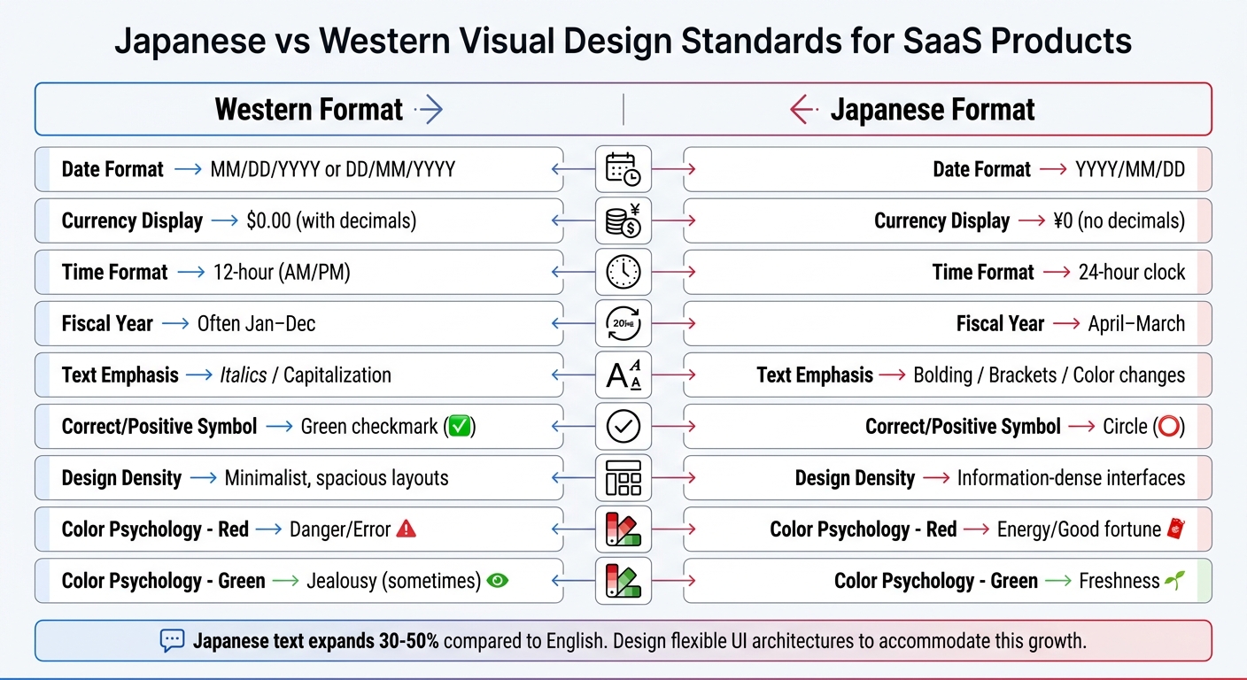
Japanese vs Western SaaS Visual Design Standards Comparison
Once you’ve set up a flexible UI architecture, the next step is to fine-tune individual visual components. This means replacing certain icons, adjusting charts to meet Japanese standards, and choosing colors that resonate better with local preferences.
Adapting Icons and Images
Some icons that work universally, like a magnifying glass for search or an envelope for messages, don’t need changes. But others might require tweaking. For instance, Japanese users often associate the ◯ (circle) symbol with "correct" or "positive" actions, rather than the Western green checkmark (✔︎).
Japanese users also value interfaces that are transparent and easy to navigate. Features should be clearly visible, with detailed tooltips instead of being hidden. Additionally, incorporating a mascot can make your brand more relatable. Mascots are culturally significant in Japan, but they must be designed thoughtfully to match professional standards. Focus on clean aesthetics and clear hierarchies to maintain a polished look.
Once icons and images are localized, the next step is to adjust data visuals.
Formatting Charts and Diagrams
Charts and diagrams need specific adjustments to align with Japanese norms. For dates, use the YYYY/MM/DD format, and for time, stick to a 24-hour clock in business contexts. Prices should be shown in Japanese Yen, using the ¥ symbol or 円 suffix. Importantly, omit decimal places since Yen doesn’t have a subunit like cents.
"Yen amounts are typically displayed with the ¥ symbol or 円 suffix. Note that the absence of subunits (no cents equivalent) means pricing psychology differs."
- Yuga Koda, Co-Founder, Nihonium
Japan’s fiscal year runs from April to March, so consider this when grouping annual data. Additionally, avoid italics or capitalization in chart labels and legends. Instead, use bold text, color variations, or traditional Japanese fonts like Gothic or Mincho for emphasis.
| Element | Western Format | Japanese Format |
|---|---|---|
| Date Format | MM/DD/YYYY or DD/MM/YYYY | YYYY/MM/DD |
| Currency | $0.00 (with decimals) | ¥0 (no decimals) |
| Time | 12-hour (AM/PM) | 24-hour clock |
| Fiscal Year | Often Jan–Dec | April–March |
| Emphasis | Italics / Capitalization | Bolding / Brackets / Color changes |
Once charts are formatted, you can focus on selecting colors that align with Japanese preferences.
Selecting Appropriate Color Schemes
Colors carry different meanings across cultures. For example, in Japan, green symbolizes freshness rather than jealousy. To build trust, go for subtle and professional color themes.
"Color psychology isn’t universal. Green suggests freshness in Japan but can mean jealousy in the West."
- Barrett Ishida, Tamko
Japanese design tends to emphasize order, clear hierarchies, and understated details that convey professionalism and reliability. You might also want to incorporate seasonal elements into your color palette, as Japanese aesthetics often reflect the changing seasons. Paying attention to these details shows cultural sensitivity and helps build trust with local users.
After tailoring these visual elements to Japanese standards, the next step is to test your designs thoroughly for cultural and linguistic accuracy.
Testing Your Localized Visuals
After localizing your visuals, it’s crucial to test them thoroughly. This step helps catch any issues that could undermine user trust and ensures both cultural and technical accuracy, especially when meeting Japan’s unique standards.
Running Cultural and Linguistic Reviews
Engage native Japanese speakers to review your visuals for cultural relevance and linguistic accuracy. These reviewers should confirm the use of proper fonts, such as Noto Sans JP or Hiragino, instead of Chinese font variants for Kanji. Using the wrong fonts can create an "Uncanny Valley" effect, where the design feels subtly incorrect. Additionally, ensure that emphasis is conveyed through font weight, size, or vertical text (Tategaki) rather than italics or capitalization, which are less common in Japanese design.
"In Japan, a single awkward phrase can undermine an otherwise strong product."
- Nihonium
It’s essential to use honorifics (Keigo) consistently throughout your visuals. This includes polite (Teineigo), respectful (Sonkeigo), or humble (Kenjougo) language, depending on the context. Also, verify that your text integrates Hiragana for grammar, Katakana for technical terms and loanwords, and Kanji to convey meaning effectively.
Make sure search bars and forms handle Input Method Editor (IME) composition correctly, so real-time validation doesn’t interfere with users selecting characters.
Testing with Japanese User Personas
Create personas that represent real Japanese user behavior and conduct usability tests with them. Unlike Western B2B environments, where decisions often rest with one person, Japanese B2B scenarios typically involve a group. Your personas should account for roles such as influencers, end-users, and executive sponsors, reflecting the collaborative decision-making process common in Japan. Use authentic Japanese job titles and organizational structures to align with real responsibilities and workflows.
Your personas should also reflect technical habits specific to Japan. For example, over 70% of Japanese B2B web traffic comes from mobile devices. Prioritize testing on smartphones and tablets to ensure your visuals perform well on these platforms. Additionally, Japanese users often associate detailed layouts with value, so your designs should accommodate high information density without feeling cluttered.
Use these personas to validate trust indicators like logos, certifications, and badges. Place them above the fold to cater to the risk-averse nature of Japanese users. Also, test forms to ensure they include local features such as Furigana (phonetic input fields) and automatic postal code address normalization. Lastly, confirm that complex Kanji characters remain legible, as they often require larger font sizes on mobile screens.
Checking Device Compatibility
Test your localized visuals across all devices commonly used in Japan, with a mobile-first approach. Responsive layouts are key to ensuring flexible containers prevent broken designs, truncated text, or overlapping elements when text expands.
Ensure fonts render correctly across devices and browsers. Consistently using native-friendly fonts like Noto Sans JP or Hiragino helps maintain a polished and readable appearance.
Interactive elements need to handle IME properly, especially for name and address fields that involve multiple character sets. Databases and APIs should adhere to UTF-8 standards to avoid text corruption or display errors. If using vertical text (Tategaki) for emphasis, confirm it displays correctly across browsers without disrupting responsive design.
| Compatibility Factor | What to Test | Why It Matters |
|---|---|---|
| Text Length | Support for 30–50% text expansion | Prevents broken menus and truncated buttons |
| Character Encoding | Full UTF-8 / Unicode support | Avoids corrupted text |
| Input Methods | IME-compatible form fields | Ensures accurate Kanji and name entry |
| Mobile Display | Fold-aware layouts, sticky CTAs | Reduces bounce rates from mobile users |
| Font Rendering | Noto Sans JP / Hiragino | Maintains a professional appearance and readability |
Once your visuals pass these compatibility checks across devices, you’ll be ready to evaluate whether further localization support is necessary.
Working with Nihonium for Localization Support
Nihonium’s Localization Services
Nihonium specializes in adapting SaaS products for the Japanese market by focusing on visual elements, not just text. Their approach tackles the challenges of visual and cultural localization, ensuring a seamless experience for users. Local experts carefully restructure layouts to avoid issues like broken menus, truncated buttons, or overlapping elements. They also choose typefaces like Noto Sans JP or Hiragino, reduce font sizes by 10–15%, and increase line heights to enhance readability.
Their services cover all aspects of visual adaptation. This includes reformatting charts and diagrams to accommodate both horizontal and vertical text flows, tailoring color schemes to align with Japanese preferences (e.g., using muted red tones), and ensuring icons convey culturally appropriate meanings. For example, in a 2025 project, Nihonium localized 150 visuals by converting currencies to yen (¥), reformatting dates, and adapting measurement units. These adjustments led to a 28% increase in dashboard engagement.
In addition to visuals, Nihonium ensures compliance with local regulations and verifies that input fields work seamlessly with Japanese Input Method Editors (IME). This prevents issues like form abandonment and data entry errors, which are common hurdles for non-localized interfaces.
By offering these specialized services, Nihonium positions itself as a key partner for SaaS GTM in Japan.
Why Partner with Nihonium
Nihonium’s expertise goes beyond technical adjustments – they bring over a decade of experience in helping SaaS companies navigate the complexities of entering the Japanese market. Their team, composed of native SaaS experts and former country managers, understands that Japanese users favor information-dense interfaces and detailed navigation over the minimalist designs often seen in Western products. This cultural understanding helps avoid missteps, such as using inappropriate colors or overlooking the importance of mobile-first design, given the widespread use of mobile devices among Japanese professionals.
"Translation changes words; localization transforms experiences. For SaaS products entering Japan, the difference between the two determines whether users adopt or abandon your product."
- Yuga Koda, Co-Founder, Nihonium
The results speak for themselves. Clients report a 25–40% increase in user retention, quicker market entry, and a 4:1 return on investment. For instance, in Q4 2024, Nihonium helped Zapier localize its workflow diagrams and icons for the Japanese market. They replaced bold primary colors with muted pastels and swapped handshake icons for bowing figures. These changes boosted user sign-ups by 28%, increasing the conversion rate from 4.2% to 5.4%, and improved onboarding completion times by 150% within three months.
Nihonium’s comprehensive approach, which combines visual localization with marketing funnel development and fractional sales support, makes them an ideal partner for SaaS companies aiming to succeed in Japan.
Conclusion
Adapting visuals for Japanese SaaS users means rethinking how your product communicates. Japanese users favor SaaS landing pages and layouts packed with information, color schemes that align with local preferences, and typography tailored to Hiragana, Katakana, and Kanji. Since Japanese text often expands by 30–50% compared to English, a UI architecture that can handle this flexibility is crucial. These design considerations make thorough testing a must.
Work with native reviewers and test across devices to identify tone inconsistencies, compatibility issues, and input method editor (IME) errors.
Effective localization can lead to impressive results: user adoption increases by 25–30%, revenue grows by 15–20%, and conversion rates improve by as much as 128%. However, achieving these outcomes requires a deep understanding of localization’s finer details.
FAQs
What visuals should I localize first for Japan?
Prioritize adjusting UI elements, icons, charts, and diagrams, as they play a major role in user understanding and confidence. Make sure designs account for Japanese text expansion, incorporate icons that resonate with local cultural context, and modify charts to align with Japanese visual preferences. It’s also important to update imagery and graphics early on to reflect Japanese aesthetics and norms, fostering a sense of connection and reliability for users.
How do I prevent Japanese text from breaking my UI layout?
To ensure Japanese text doesn’t disrupt your UI layout, you can apply specific CSS properties tailored to Japanese line-breaking rules. Start with word-break: break-all to allow text to wrap properly and pair it with overflow-wrap: break-word to prevent content overflow.
Additionally, take into account 禁則処理 (kinsoku shori) rules. These define acceptable places for line breaks in Japanese text, helping to maintain readability and a polished appearance. By combining these techniques, you can keep your UI both clean and user-friendly.
What are the biggest IME mistakes in Japanese forms?
One frequent issue with Japanese IMEs (Input Method Editors) is starting in Half-width alphanumeric mode instead of Hiragana. This can lead to improper text input, especially when trying to type in Japanese. Another common problem occurs with input finalization, where incomplete input blocks proper kanji suggestions. Additionally, glitches in the system can sometimes result in characters being output incorrectly.
These errors are often linked to improper setup or occasional system bugs. It’s not uncommon to encounter messages like "Japanese IME is not ready yet", which indicate configuration issues. Taking the time to ensure your IME is correctly set up can go a long way in avoiding such frustrations.