

If your Japan page is only translated, it may still fail. I’d treat this as a design problem, not just a language problem.
Here’s the short version: Japanese SaaS pages often need more visible detail, more trust signals, and less hidden information than U.S. pages. That applies across landing pages, ads, and product/pricing pages. And the payoff can be big: fully localized SaaS products in Japan can see 25%–30% higher adoption, 15%–20% higher revenue, and in some cases up to 340% higher conversion rates than direct translations.
If I were checking a page for Japan, I’d look at these 7 things first:
- Page density: Does the page show enough detail to help someone share it inside their company?
- Text fit and type: Can Japanese text fit buttons, forms, and nav without breaking the layout?
- Icons and labels: Are symbols labeled and easy to understand at a glance?
- Color use: Does the page use color in a way that feels familiar in Japan?
- Layout flow: Are key details visible early instead of hidden in tabs or accordions?
- Images and proof: Do visuals show Japanese users, local logos, and clear case studies?
- Trust marks: Are address, phone number, company info, security badges, and payment marks easy to find?
A U.S. page can look polished and still feel too empty for Japan. That’s the core issue. I’d sum up the article like this: make the page easy to scan, easy to trust, and easy to share internally.
| Area | Common U.S. pattern | What Japan often expects |
|---|---|---|
| Page style | Light copy, lots of white space | More detail, more visible proof |
| CTA path | One main action | Main CTA + 資料請求 / materials request |
| Navigation | Hidden or reduced options | Clear labels and familiar placement |
| Social proof | Small logo row | Bigger logo wall, local case studies |
| Trust info | Limited footer details | Address, phone, legal and payment info shown clearly |
Below, I’d use the 7 rules to show what to change and where it matters most.
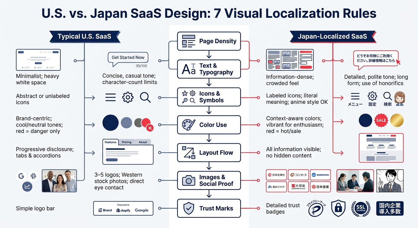
U.S. vs. Japan SaaS Design: 7 Visual Localization Rules
Why Japanese Visual Expectations Differ from U.S. SaaS Norms
Japanese B2B buying often moves through a formal internal approval process. So a page usually has to work for more than one stakeholder, not just the person who landed on it. This difference is structural, not just a matter of taste. It shapes how much detail, proof, and context the page needs to carry.
More Detail Before Conversion
Japanese buyers often want to see scope, use cases, pricing context, support details, and company credibility before they take action. A downloadable PDF with a company overview, product details, and case studies gives them something they can pass around internally. That also means the page itself needs to make key details easy to scan, review, and save.
Trust Signals Carry More Weight
Buyers want visible proof that a vendor is established, reliable, and serious about the market. In practice, that usually means things like customer logos, local case studies, certifications, and clear contact information matter a lot. You’ll often see this shown through a large logo wall.
"It’s easy to tell which vendors know what they are doing and are really committed to the market just through the quality of their materials." – Naoki Togawa, Nikkei Business Publications
When those trust signals are missing, the problem isn’t just lower conversion rates. A buyer may stop right there. As localization QA specialist Munehiro Hiraki put it: "Japanese enterprise buyers do not explicitly say ‘your Japanese is bad.’ They simply do not proceed. The localization gap is invisible to the seller – but it is the first thing the Japanese buyer notices."
The 3 Surfaces That Need Localization
These expectations show up in different ways depending on where a buyer meets your product. The seven design rules in this guide focus on three surfaces:
| Surface | Primary Goal | Key Localization Need |
|---|---|---|
| Landing Pages | Build trust and explain scope | Dense copy, downloadable assets, strong trust signals |
| Digital Ads | Earn attention in limited space | Short formats, Japanese subtitles, credibility cues |
| Product & Pricing Pages | Reduce buyer uncertainty | Yen pricing, local payments, security and compliance details |
Those differences connect directly to the seven design rules that follow.
sbb-itb-a752276
1. Page Density and Information Completeness
The first rule is density: give buyers enough information to explain your product to other people inside the company.
In the U.S., a clean, spare landing page often feels confident. In Japan, that same page can come across as thin or unfinished.
This isn’t just about design taste. Japanese B2B buyers often have to get internal approval before they can book a demo or make a purchase. So one person landing on your page may need enough detail to brief other decision-makers. That usually means:
- company background
- technical specs
- case studies
- security information
If those details aren’t there, buyers may not ask follow-up questions. They may just leave.
The answer isn’t stuffing the page with extra copy. It’s structure. High-performing Japanese SaaS pages tend to use modular, block-based layouts with clear visual separation. They also put a value headline, short benefit summaries, and trust badges above the fold so buyers can scan and find what they need fast.
Density only works when the page still feels easy to scan. That leads straight into the next rule: readable text structure.
It also helps to add a secondary CTA like "Request Materials" (資料請求) next to a primary "Free Trial" button. That gives buyers who are still comparing options something they can share internally. On product and pricing pages, keep pricing, security, and support details visible without making people click around to find them.
2. Text Length, Typography, and Content Structure
Once a page includes enough detail, the next check is simple: can Japanese text fit the layout without breaking it?
Japanese can throw off layouts built for U.S. English. It often uses 30–50% fewer characters than English, but still takes up 10–15% more pixel width because Japanese characters are full-width glyphs. That’s why localization briefs should use maximum pixel widths, not character counts. If you stick to character limits, you can miss the problem until the UI starts cracking at the edges.
Buttons, navigation, and forms are where this shows up first. Japanese CTA buttons can stretch to 1.4× the pixel width of the English source, and nav items and form labels tend to expand too. If the layout doesn’t flex, those breaks can slip in quietly and make the page feel off.
For type, use Noto Sans JP or another Japanese-friendly Gothic sans-serif. Set line height around 1.7–1.85, and go with 16px or larger on mobile. Those settings make the text easier to scan and help the page breathe a bit.
Tone matters too. Use polite-formal Japanese by default. In B2B, casual wording can come across as immature.
For forms, use stacked labels. Inline labels tend to wrap badly in Japanese, which makes the interface look cramped and awkward. It’s a small choice, but users notice it. It signals that the page was made for them, not just converted. This level of detail is critical because of the importance of localization for SaaS products in Japan, where users expect a native experience.
Text fit is only part of the interface; symbols and icons need the same level of localization.
3. Icon Use, Micro-Symbols, and Cultural Cues
Once the text fits, the symbols need to feel native too. Icons have to make sense at a glance. In Japan, a symbol only helps if the meaning is instantly clear. The cue should also match the page: certifications on landing pages, compliance marks on product pages, and payment logos on pricing pages.
Use trust marks Japanese buyers already know. That includes ISO 27001, ISO 9001, the Privacy Mark (P-Mark) for APPI compliance, and SSL security icons. Where you place them matters. On landing pages, they help with recognition. On pricing pages, they add reassurance. In ads, keep things simple.
One common mistake is using icons with no labels. Japanese users often read unlabeled symbols as missing information, so each icon should come with a clear label. That matters most on product and pricing pages, where buyers want every detail to look intentional.
The 資料ダウンロード button signals a formal B2B SaaS sales asset buyers can share internally.
On pricing pages, small payment icons and marks pull their weight too. Use JCB alongside Visa and Mastercard. Add Japan-specific payment logos such as PayPay, LINE Pay, and Rakuten Pay to show local readiness. Those logos tell buyers the product fits the market. For companies needing deeper support, localization and go-to-market services can help navigate these cultural nuances.
4. Color Choices and Visual Emphasis
After icons and symbols, color becomes the next fast trust signal. In Japan, color does two jobs at once: it helps build trust and shows visual hierarchy. Navy blue is the go-to pick for B2B credibility because it signals reliability and seriousness. Red works a bit differently than many U.S. designers expect. In Japan, it can signal positivity, energy, sale pricing, celebration, urgency, and new labels. So if you use red ONLY for error states, you may miss a strong action color.
The bigger danger is going too minimal. A sparse, whitespace-heavy layout that looks polished to a U.S. audience can come across as vague, or even like the company is hiding details, in Japan. As Yuga Koda notes:
"Japanese users assess websites… for cues of dedication to the user experience (UX). When aesthetic choices appear arbitrary or overlook local tastes, trust is diminished and conversion rates may suffer."
For ads, color use changes by audience segment. Consumer campaigns can lean on high-saturation red and yellow to signal value and urgency. Premium or enterprise SaaS ads, on the other hand, tend to work better with restrained, muted palettes. On product and pricing pages, color should back up trust and help people find the main action, the proof, and the reassurance fast.
A few color cues matter here:
- Avoid heavy black, which can feel somber.
- White can signal cleanliness and formality, but too much can feel empty.
- The page should feel complete, deliberate, and trustworthy.
| Color | U.S. SaaS Association | Japan Association / Usage |
|---|---|---|
| Navy Blue | Corporate, conservative | Reliability, seriousness, B2B credibility |
| Red | Danger, stop, urgency | Positivity, energy, sale pricing, celebration |
| White | Minimalism, premium | Purity, cleanliness (excess reads as "empty") |
| Orange | Warmth, approachability | Enthusiasm, affordability, value pricing |
| Yellow-Green | Nature | Common for "Free Trial" CTAs |
Once color sets emphasis, layout needs to guide the scan.
5. Layout Flow, Navigation Density, and Scanning Behavior
Once color sets emphasis, the layout has to do the next job: make scanning feel easy. Page structure signals trust. Modular sections, clear headings, and bulleted summaries help users move straight to the part they need.
"Japanese users prefer to understand everything before taking action. Reducing visible information too much can lower trust and increase bounce rates." – Ilari Nojonen
That quote gets to the heart of it. In many cases, hiding specs behind accordions, tooltips, or “show more” links doesn’t feel clean. It feels evasive. So if a detail helps someone decide, keep it visible instead of making them dig for it. At the same time, the first screen should still stay centered on the main path to action.
Japanese design also tends to lean toward vertical content flow and predictable navigation placement. Users often expect clearly labeled buttons and controls that stay in familiar spots. Hamburger menus, icon-only buttons, and hidden interactions can add friction fast. On mobile, a sticky CTA helps because it stays in view during long scrolls.
There’s also a small technical point that matters more than many teams expect: do not truncate Japanese text with CSS ellipsis. In Japanese, the verb often comes at the end of the sentence, so truncation can hide the part that tells the user what to do. This can hurt button labels, navigation items, and error messages.
Put simply, these layout choices affect how fast Japanese buyers move from overview to proof to action. This transition is a critical part of entering the Japanese market.
| Layout Element | U.S. SaaS Norm | Japanese Expectation |
|---|---|---|
| Information flow | Progressive disclosure (tabs, accordions) | Upfront, full, visible early |
| Navigation style | Hamburger menus, icon-only buttons | Labeled, predictable, consistent |
| CTA placement | Single strategic points | Sticky, persistent (especially on mobile) |
6. Image Selection and Social Proof Visuals
Once a page feels easy to scan, images become the next trust check. People judge them fast. In a local market, the wrong image can hurt trust before anyone even starts scrolling.
Local imagery matters more than generic stock. It shows you’re serious about your SaaS GTM in Japan. Use Japanese subjects in local work or everyday-life settings. In Japan, professional images often lean toward a slight gaze deflection or a three-quarter profile instead of direct eye contact, which can come across as aggressive in this market.
Social proof also needs more structure and more volume. Japanese buyers usually want to see more logos, more visibility, and clearer labels. On Japanese SaaS landing pages, it’s common to show 20+ client logos, sorted by prestige and paired with small industry tags like "Manufacturing" or "Finance".
"The more number of enterprise logos, the more security in decision making. Both the quantity and the recognition of the logos are important to provide a sense of security for the buyer." – Yuga Koda, Nihonium
Case studies should follow that same clear format. A simple four-block layout works well:
- the problem (課題)
- the reason for selection (選定理由)
- the implementation process (導入プロセス)
- quantified results (導入効果)
Use real company names and job titles. That extra specificity helps the proof feel solid, not vague.
Placement matters too. On landing pages, lead with local faces and a large logo wall. On ads, use one local image plus one trust cue. On product pages, put logos and case studies close to pricing and signup, right where people start weighing risk.
| Social Proof Element | U.S. Default | Japan-Localized Use |
|---|---|---|
| Client logos | 3–5 high-profile logos | 20+ logos, ordered by prestige, with industry labels |
| Human imagery | Western stock, direct eye contact | Japanese subjects, three-quarter profile shots |
These visuals prepare the next trust layer: badges and assurance marks.
7. Trust Marks, Badges, and Assurance Signals
After logos and case studies, Japanese buyers want one more thing: proof that the business is legit.
Logos and case studies help build confidence. But badges, legal details, and local payment marks help clear that last bit of doubt. In Japan, trust marks feel less like a nice extra and more like part of the baseline. If those signals are missing, many Japanese B2B buyers read the page as unfinished or hard to trust.
Japanese buyers expect visible proof that the company is real, local, and easy to contact.
The trust signals that matter most are the ones tied to company identity: a full physical address, a local phone number, and the 13-digit company registration number (法人番号). Those details show that the vendor is established and reachable, not just a foreign product with a translated page.
Just as important, the signal has to appear in the right place. Put badges above the fold. Place APPI-compliant consent text next to forms. Keep corporate details in the footer. The business address, phone number, and service hours should also live in the footer, because email-only support can make the company seem less committed to the local market. On pricing pages, familiar local payment icons like JCB, konbini, and bank transfer (furikomi) add one last layer of reassurance.
Skipping this has measurable costs. If a Japanese landing page shows fewer than 4 out of 7 key company identity signals – address, phone, registration number, founding year, representative name, employee count, and paid-in capital – it is likely to underperform on trust-dependent conversions.
Use the placements below as the default pattern.
| Trust Signal | What to Show | Where to Place It |
|---|---|---|
| Security/Privacy | ISO, SSL, Privacy Mark (P-Mark) | Above the fold, near lead forms |
| Awards and recognition | Usability and customer satisfaction awards | Above the fold |
| Corporate Identity | Full address, local phone number, registration number | Footer, contact page |
| Legal disclosure | Act on Specified Commercial Transactions | Footer, near lead forms |
| Payment Assurance | JCB, konbini, bank transfer (furikomi) icons | Pricing page, checkout |
How to Apply the 7 Rules Across Landing Pages, Ads, and Product Pages
Use the seven rules a bit differently on each page. Landing pages need more detail. Ads need to pack proof into a tiny space. Product and pricing pages should clear up doubt before it slows the buyer down.
Landing Pages: Add Depth Without Losing Structure
For landing pages, a modular, block-based layout works well. Lead with the value headline, Japanese client logos, and security marks above the fold. Then build out the page with specs, comparison tables, and case studies, all on the page so people don’t have to hunt for basics. It also helps to place a "Request Materials" (資料請求) CTA next to the main action, giving visitors a lower-pressure next step.
Ads have to do the same job with much less room.
Ads: Increase Clarity in Limited Space
Ad space is tight, but Japanese buyers still want context and reassurance before they click. So instead of opening with a pushy command like "Get Started", use formal business Japanese such as "Start a Free Trial" (無料トライアルを申し込む). That small shift can make the message feel more comfortable.
Even one trust cue can help lower hesitation, like a "No. 1" award badge, a Japanese client logo people know, or a security mark. In the copy, use numbered metrics like "34% efficiency gain" instead of broad benefit claims. Specific numbers tend to feel more believable. On the design side, ad layouts should use flexible containers and font sizes that stay easy to read on mobile.
"Japanese B2B SaaS buyers are notably cautious and seek a level of reassurance that often exceeds Western standards." – Yuga Koda, Co-Founder, Nihonium
Product and pricing pages pick up from there by clearing up the last bits of doubt.
Product and Pricing Pages: Reduce Buyer Uncertainty
On product and pricing pages, show pricing in Yen with tax-inclusive totals. Add local payment options, an on-page FAQ, visible support details, and both a high-commitment CTA and a lower-commitment "Download Catalog" option.
U.S.-Style vs. Japan-Localized SaaS Design: A Side-by-Side Comparison
The seven rules above don’t look the same on the page. In practice, U.S. SaaS design and Japan-localized SaaS design can feel miles apart.
This table gives you a quick side-by-side view. It helps you spot where a U.S.-style page may come across as too sparse, too hidden, or too generic for Japan.
| Design Element | Typical U.S. SaaS Pattern | Japan-Localized Version | Why It Matters |
|---|---|---|---|
| Page Density | Minimalist; heavy white space | Information-rich, modular blocks | Empty space can read as incomplete. |
| Copy Volume | Concise, punchy, casual tone | Detailed, formal (keigo), explanatory | Japanese buyers expect more proof and a formal tone. |
| Icon Treatment | Abstract or minimal line icons | Functional icons paired with micro-text labels | Japanese users prefer icons with clear labels. |
| Color Usage | Brand-centric; often cool or neutral tones | Red for urgency or sales; muted tones for enterprise trust | Color meaning differs by market. |
| Layout Flow | Progressive disclosure; content hidden behind clicks | Long-form, story-driven vertical scroll | Specs, FAQs, and proof should stay visible. |
| Imagery | Global or Western stock photography | Local Japanese models and realistic usage scenes | Signals local commitment. |
| Trust Marks | Simple logo bar ("Trusted by…") | Legal disclosures, security badges, and awards | Buyers need visible proof the vendor is legitimate. |
One small detail makes a big difference: build flexible containers for buttons, navigation, and labels. Japanese text often expands, and a layout that looks fine in English can start to break fast once the copy is localized.
There’s also a trust gap worth noticing. U.S. pages often lean on logos as social proof. Japanese pages usually go further. They show legal disclosure pages, security certifications, and awards in visible parts of the experience, not tucked away as an afterthought or left inside a simple logo bar.
Once you can see these design gaps clearly, the next step is figuring out which assets need the deepest localization.
When to Get Help from a Japan Localization Partner
When these seven visual rules start hitting product pages, forms, and funnel assets all at once, outside support can save your team a lot of time. It’s one thing to spot the issues. It’s another to fix them across UI, forms, and landing pages without things slipping through the cracks.
Signs Your Team Needs Outside Support
A translation-only launch that brings in traffic but doesn’t convert is usually a clear sign that the page needs more than translated copy.
Some problems are less obvious, but they still hurt performance. Missing 資料請求 CTAs, 必須 labels, furigana validation, or postal-code autofill can lower form completions. Those issues tie back to the earlier rules around text structure and form layout. Tone is another big one. If your page uses casual wording where formal keigo is expected, it can come across as unprofessional in a B2B setting, even when the translation itself is correct.
In most cases, the problem isn’t one big error. It’s a stack of small mismatches across page layout, forms, and trust elements.
What a Localization Partner Can Help You Execute
A Japan-focused partner can help with the work in-house teams often find hard to pull off across page density, typography, form behavior, trust signals, and funnel assets. That can include:
- Product UI localization with Japanese input compatibility
- Landing page redesigns that balance information density with clean design
- Marketing funnels built for longer Japanese buying cycles
- Sales collateral for internal approval
- Japan-specific go-to-market planning built around the trust signals buyers expect
Nihonium provides Japan localization and go-to-market services for global SaaS companies. Their offerings include product localization, landing page redesign, funnel creation, and sales collateral for internal approval.
Conclusion
These seven rules show why translated pages often struggle in Japan. Japanese visual localization comes down to trust. Page density, copy structure, icons, color, layout, imagery, and trust marks all affect whether a buyer feels safe enough to move ahead. This sense of security is a major factor in SaaS adoption in Japan.
localized sites in Japan can convert far better than direct translations – up to 340% higher conversion rates compared to direct translations. That’s the reason visual localization matters just as much as the translation itself.
"Translation is a language task. Localization is a market entry strategy." – Yuga Koda, Co-Founder, Nihonium
A strong product and accurate translation, by themselves, won’t always do the job. If a page lacks proof points, uses a casual tone, or feels too sparse, conversion can still drop. In plain terms, trust weakens, and action slows down.
The last test is simple: every visual choice should make the page easier to trust, scan, and share internally.
FAQs
How do I know if my Japan page is too sparse?
In Japan, a sparse page can come across as unfinished, amateur, or hard to trust. Many Japanese users expect high information density. They want to see details, specs, and trust signals right away.
So if your page relies heavily on white space, it may feel empty instead of clean. Make sure the basics are there, such as:
- company registration info
- customer service details
- clear product explanations
- enough context and data points
- client logos
A page doesn’t need to feel crowded. But it should give people enough information up front to feel confident about what they’re looking at.
Which trust signals matter most for Japanese SaaS buyers?
The strongest trust signals are localized case studies, testimonials from recognized Japanese companies, and clear details on privacy, stability, and reliability.
It also helps to show that your business is real and easy to verify. That means including a physical address, company registration number, executive photos, security badges, certifications, legal disclosures, FAQs, and clear pricing.
In Japan, detailed and well-structured information often builds trust instead of feeling cluttered.
What should I localize first: landing pages, ads, or pricing pages?
Prioritize landing pages first. In Japanese B2B, buyers often do a lot of research before they make a move. In many cases, a single page helps them collect the details they need and share them internally to get buy-in.
That means your landing page is often the main place to build trust and show you’re a safe choice.
You can include pricing on that page. But the bigger goal is a page that feels detailed, credible, and packed with the kind of proof local buyers expect. Think clear information, strong social proof, and enough depth to help someone make the case inside their company.
Related Blog Posts
- Japanese UI/UX Design: Key Requirements for SaaS
- Western vs. Japanese SaaS Design: Key Differences
- How Japanese Culture Shapes SaaS Messaging
- 5 Content Tips for Japanese SaaS Audiences
 Japanese
  English